"EUREKA! is an annual multi-level, interdisciplinary design workshop experience open to RIT students who want to use their skills for social good." (From EUREKA! RIT CAD Website)
Overview
Research and ideation on the logo of choice for inspiration to design or recreate the logo. The logo can be based on the concept of logotype, product/service, allegorical, literal/illustrative, abstract, or initial/acronym.
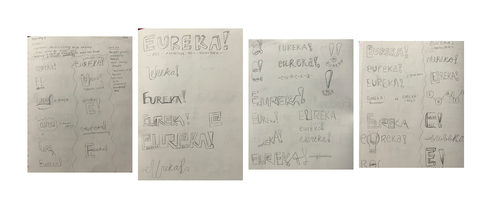
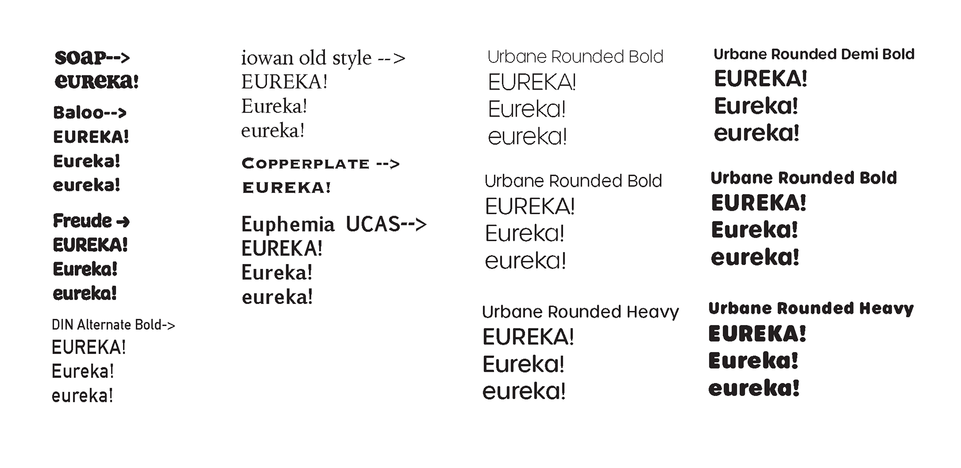
Began with a type study to analyze which typeface(s) best suits the logo. Then developed a word list and brainstormed about how to recreate the logo to become more effective. Also, include a presentation panel of the logo to show how it is used and the possible variations of the logo.

Ideation
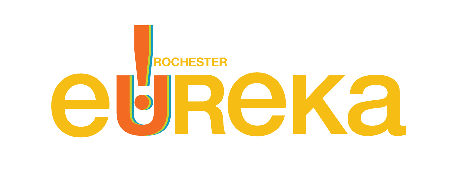
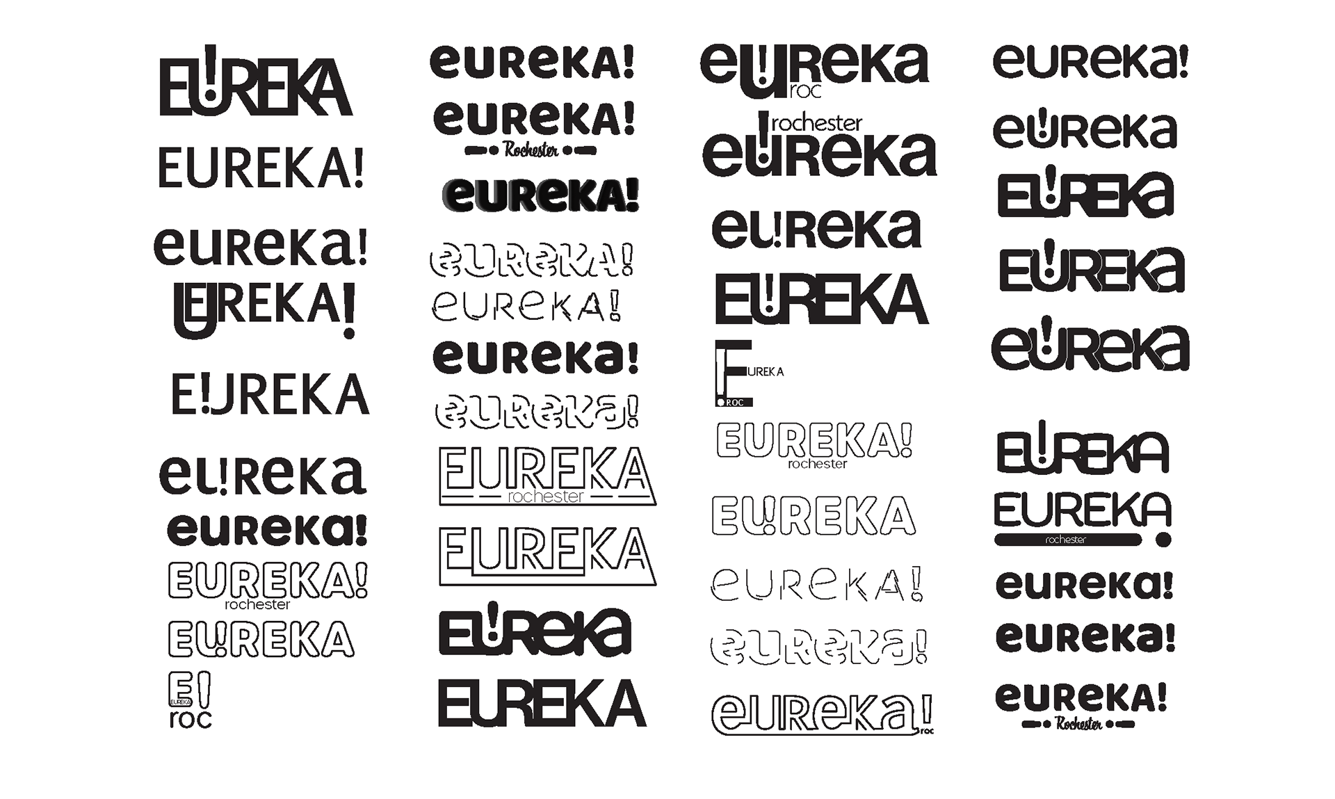
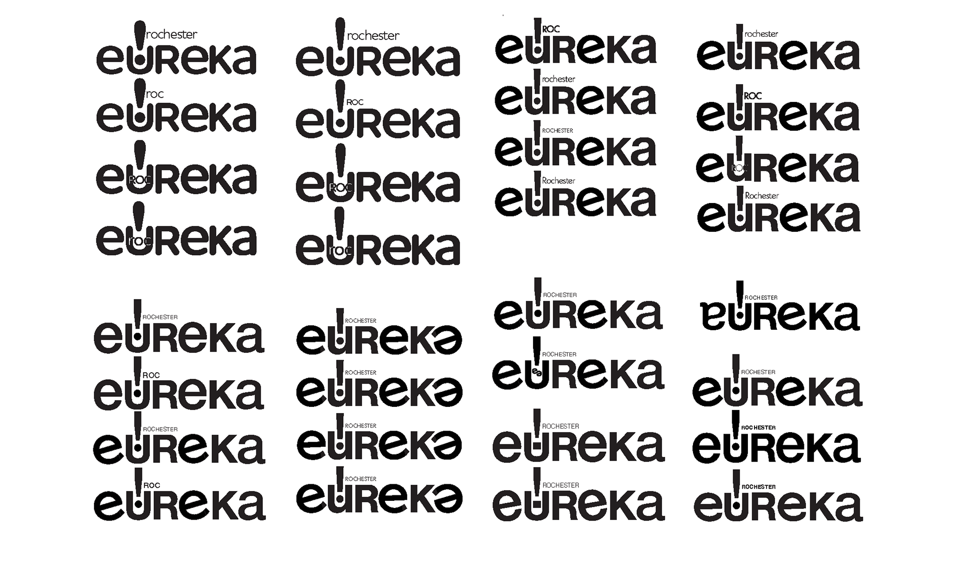
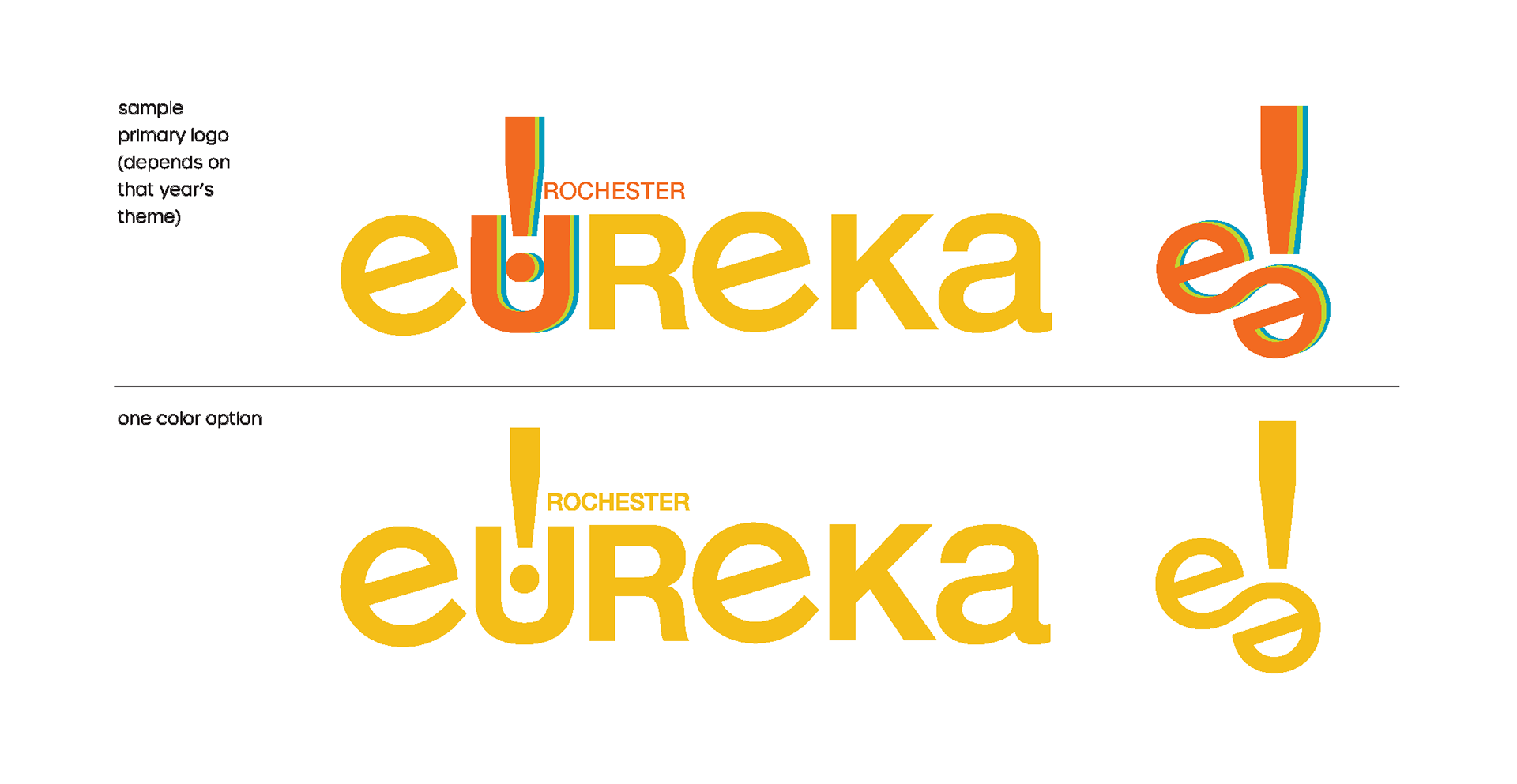
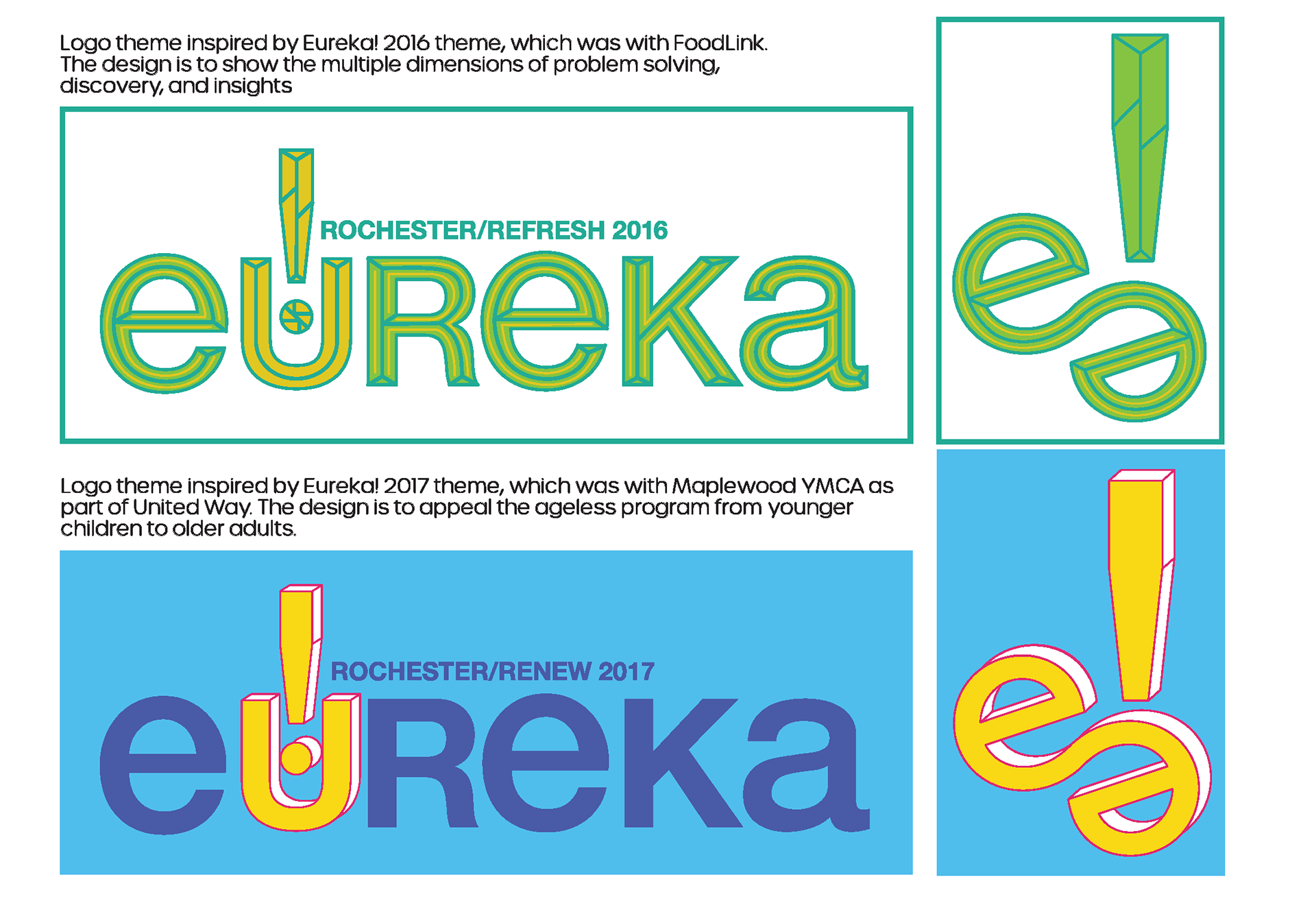
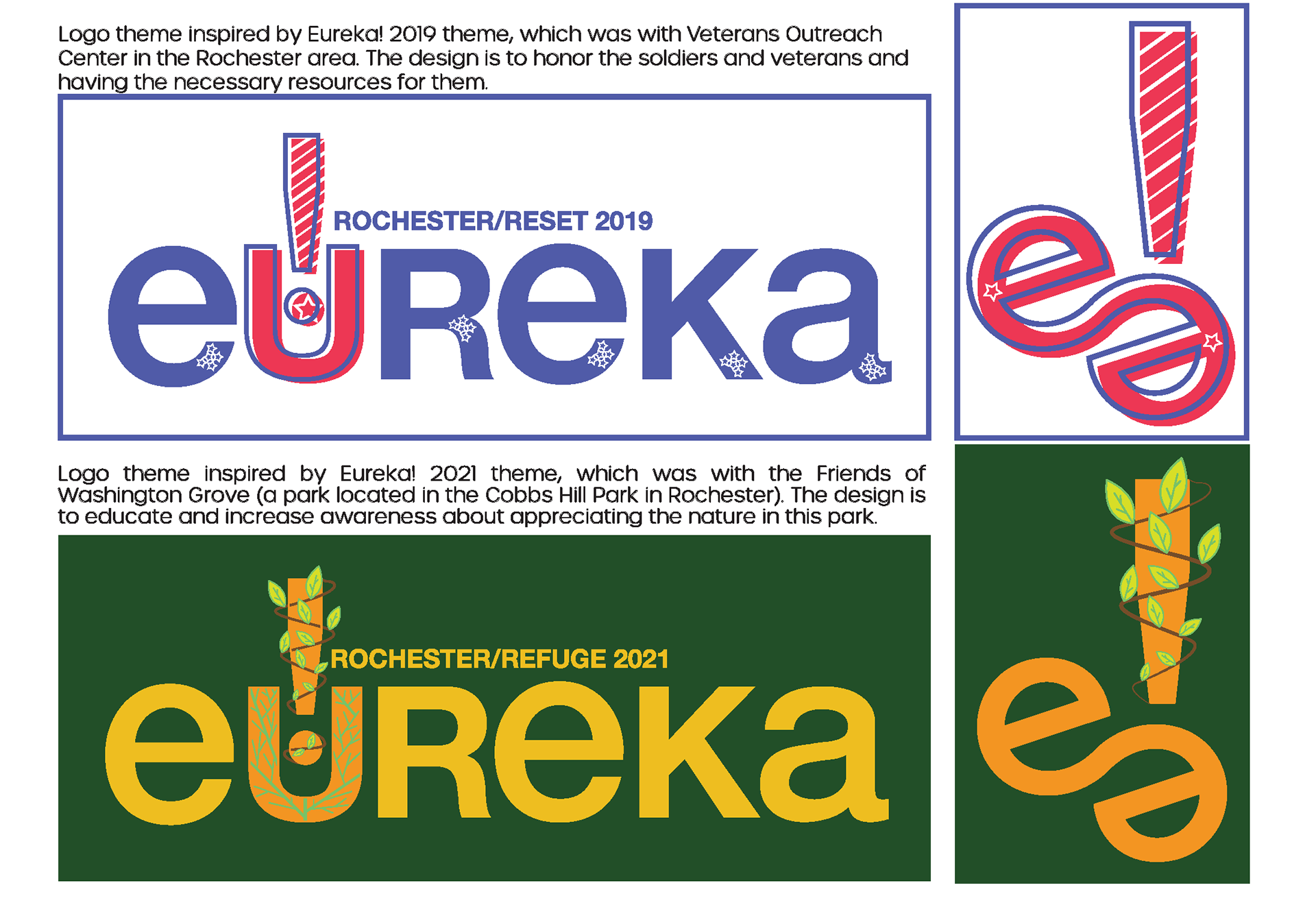
Decided to recreate the EUREKA! logo. The original logo was all in capital letters and to make it more interesting I decided to use unicase for the logo. Also, I use the exclamation point to mimic the location icon and the exclamation point represents the location where the event takes place, which is in Rochester. Furthermore, using the recreated EUREKA! logo, I redesign previous years’ EUREKA! logo using the inspiration of the event.
SKETCHES
TYPE STUDY

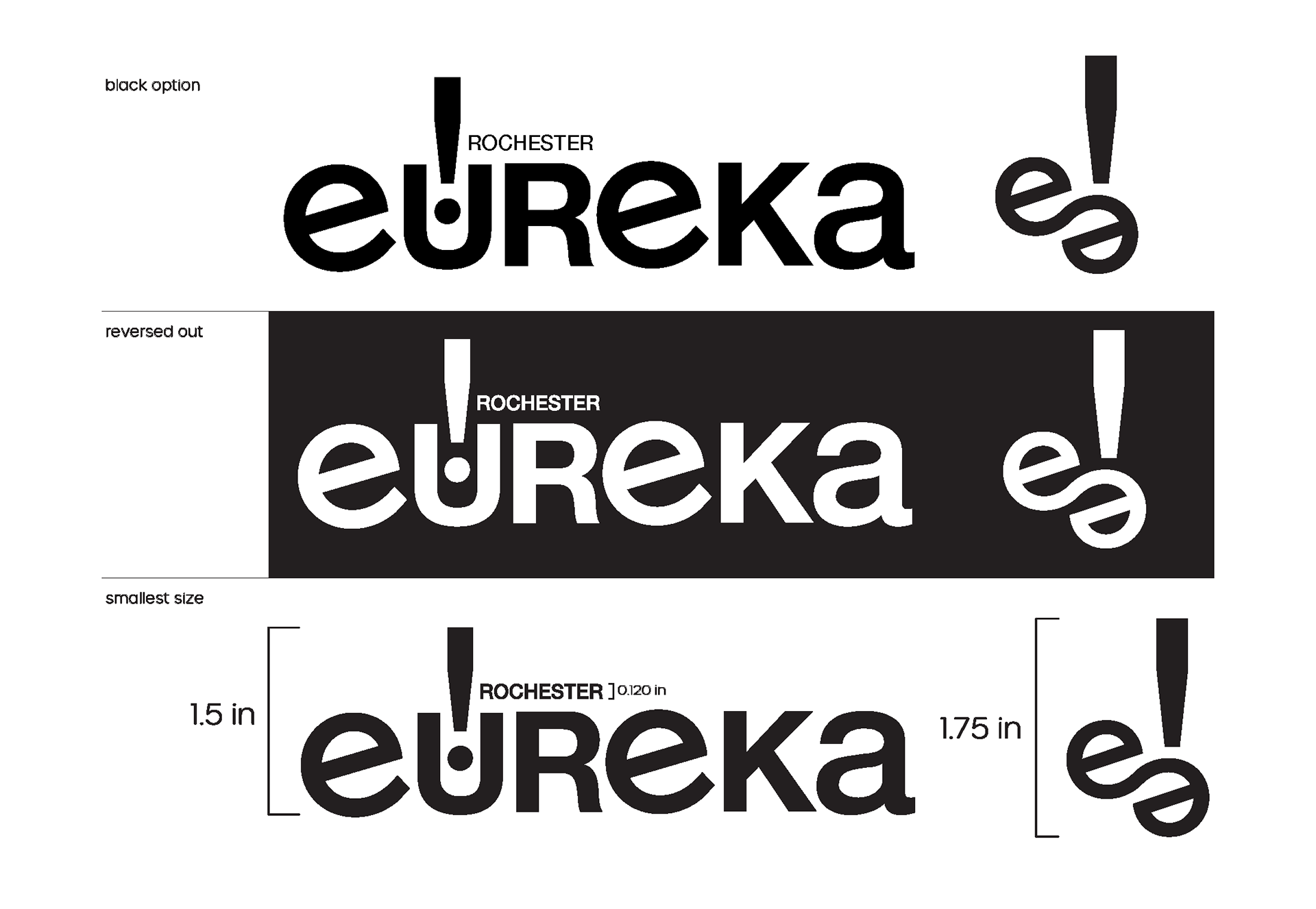
FINALIZED BRAND GUIDELINES

LOCKUPS
MOCKUPS
Initial Mockups
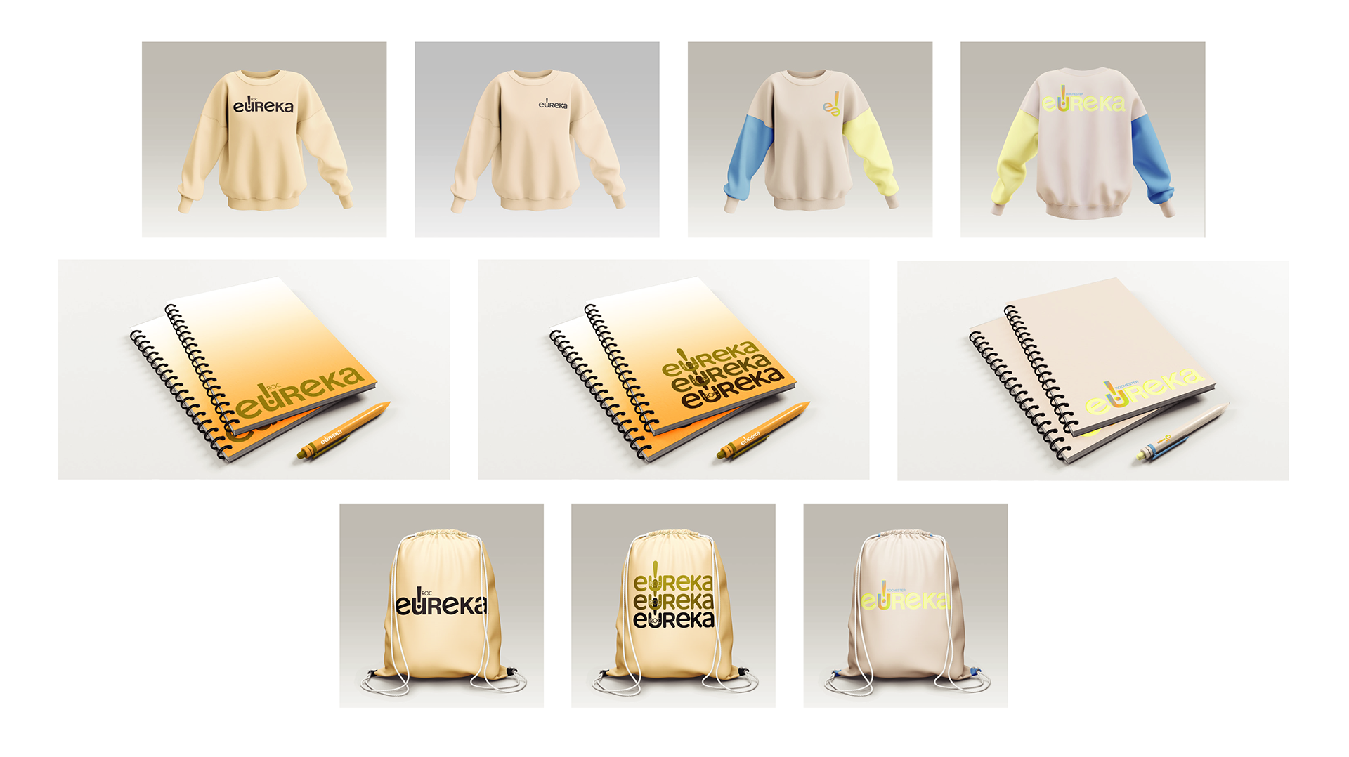
Finalized Mockups

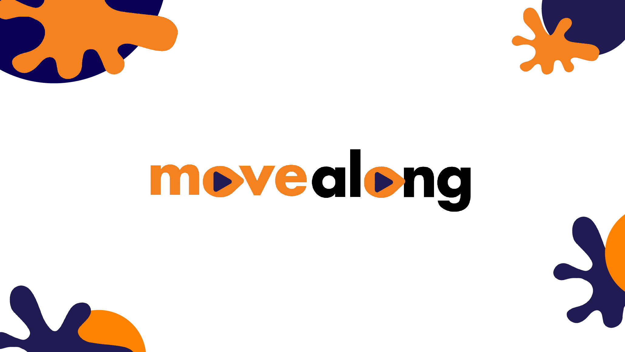
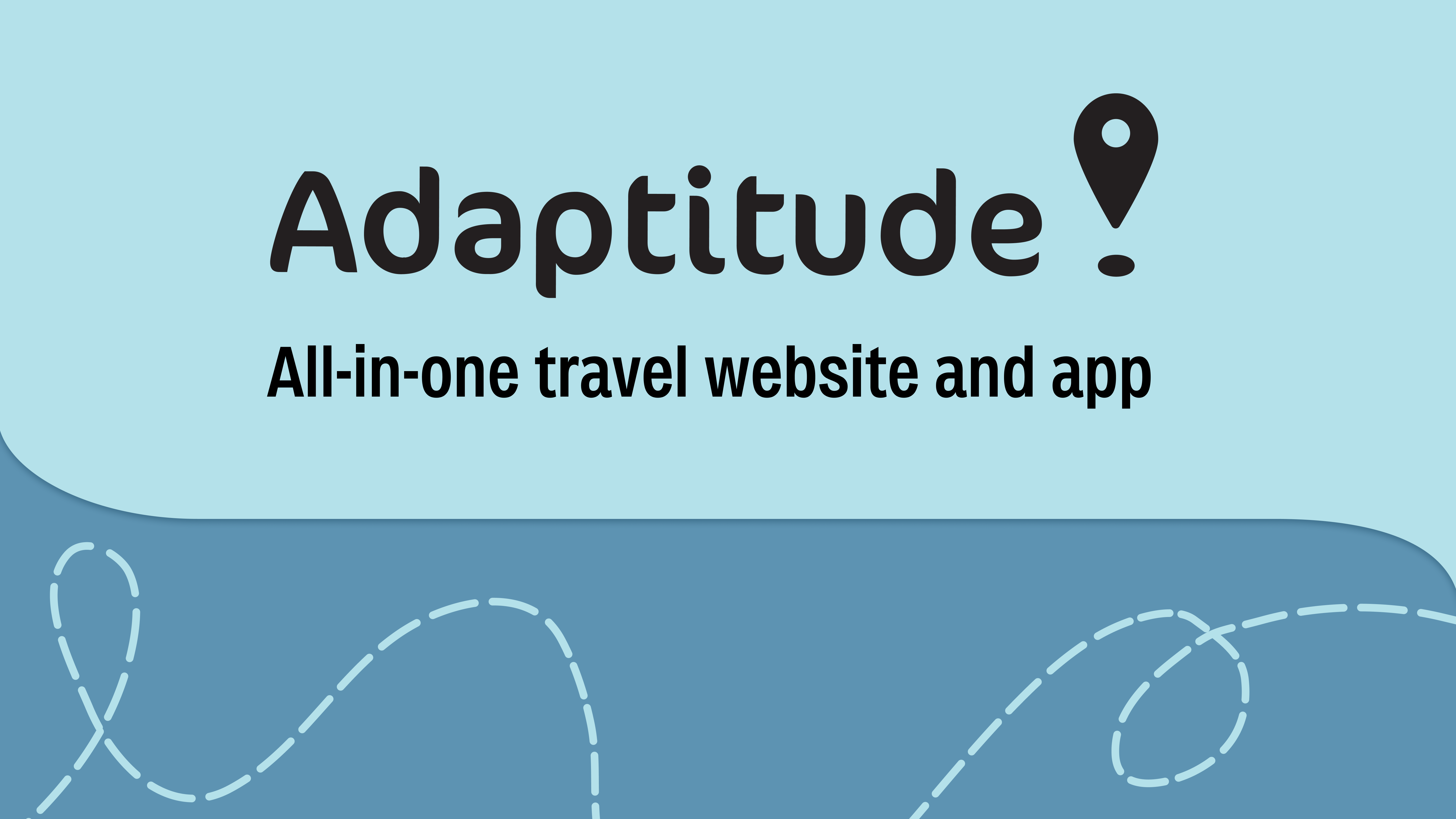
APPLICATION OF NEW REDESIGNED LOGO
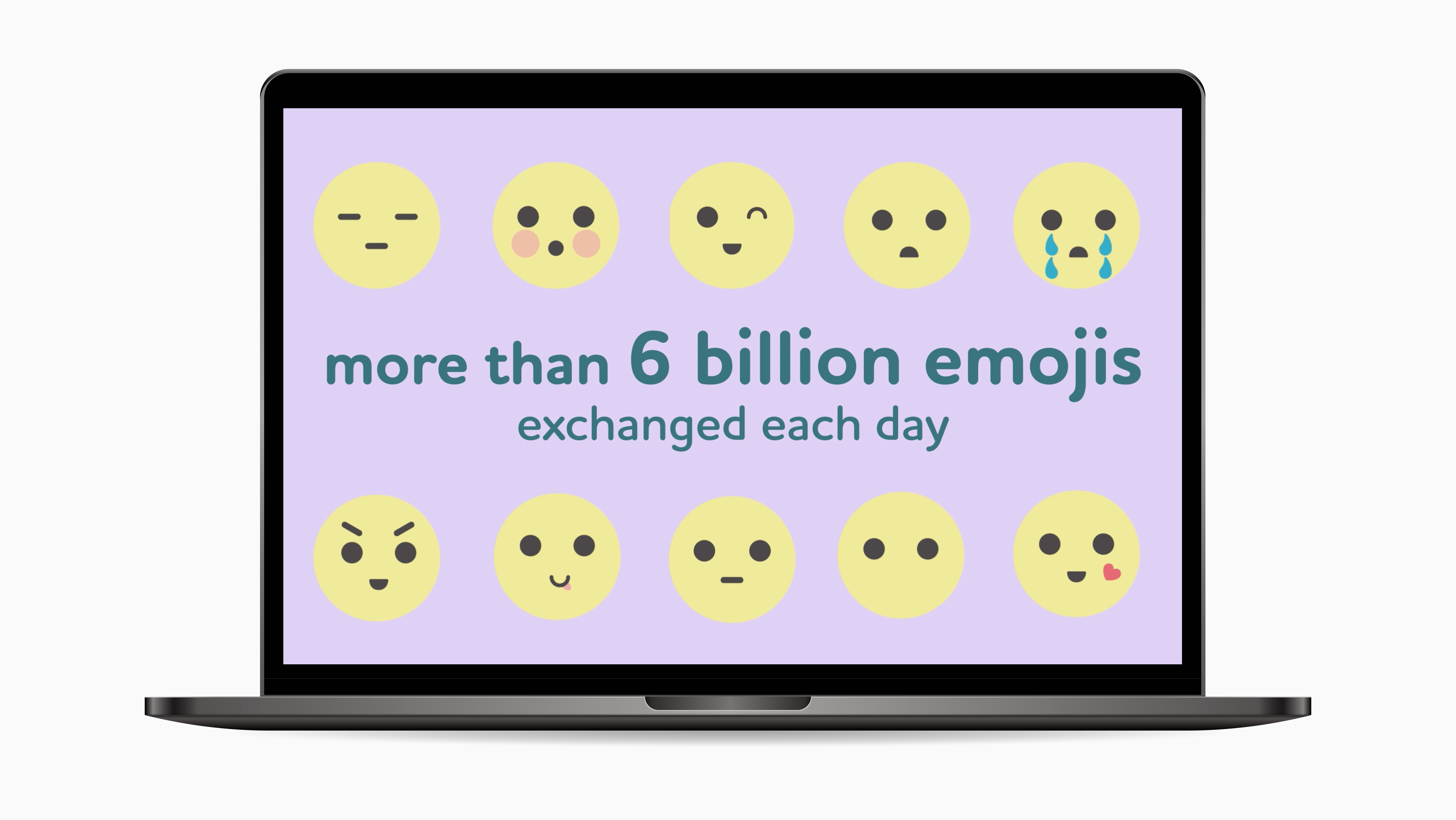
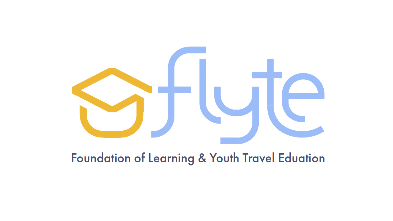
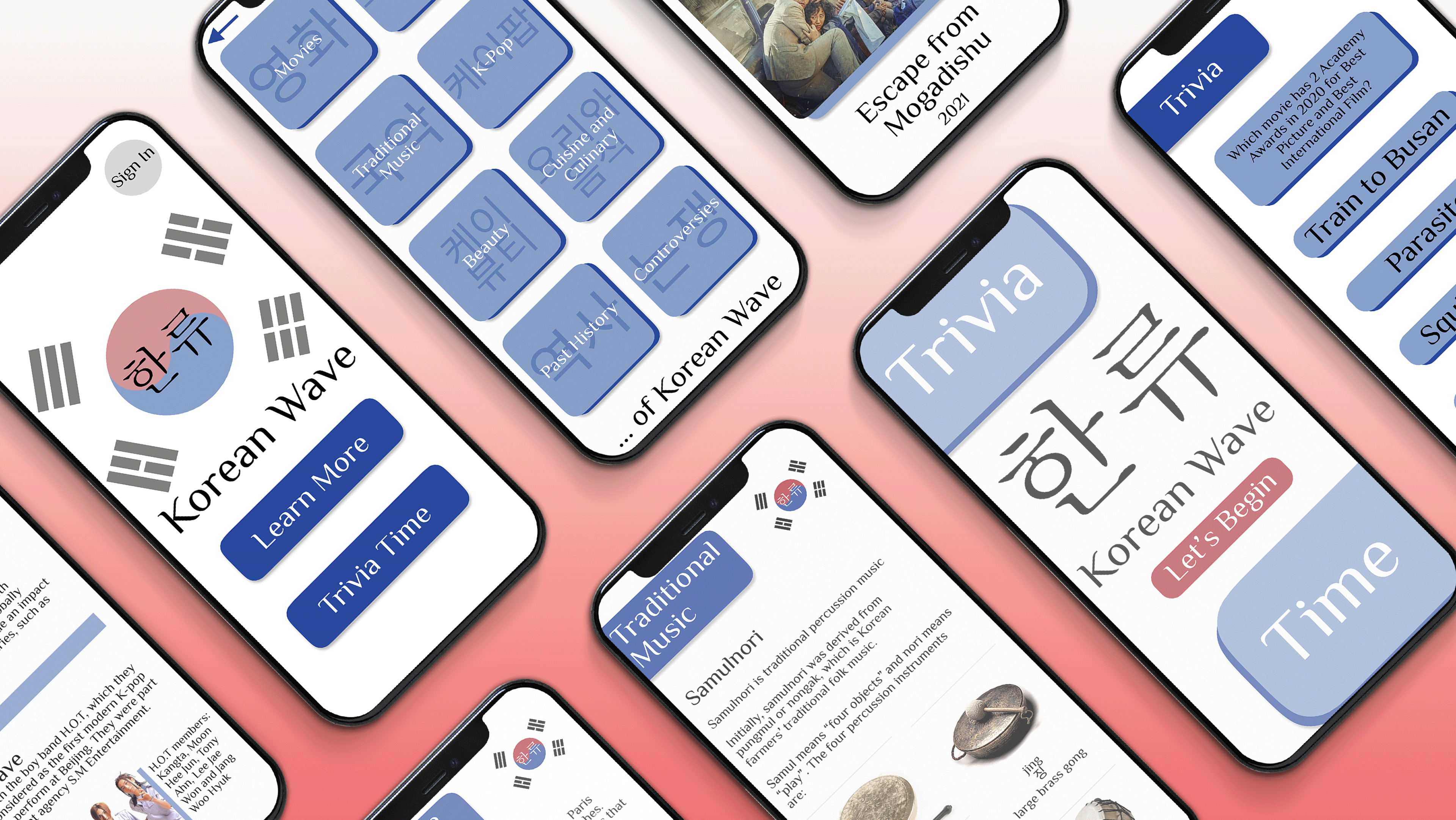
Previous EUREKA! Themes Application
FINAL REDESIGNED LOGO